9 website design tips to increase hotel direct bookings
A guest lands on your website because they already want to stay with you. They found you on Google, clicked a link from Instagram, or typed your name in after seeing you on Booking.com. The hard part, the discovery, is already done.
What happens next is on your website. And most hotel websites lose guests right at this point, not because the property isn't appealing, but because the site gets in the way.
Here are 9 design changes that make a real difference in whether a visitor books directly or bounces back to an OTA, plus what to check in the booking engine sitting underneath it all.
1. Win the first three seconds
Guests decide whether to stay on a hotel site almost instantly. Two things earn that first look.
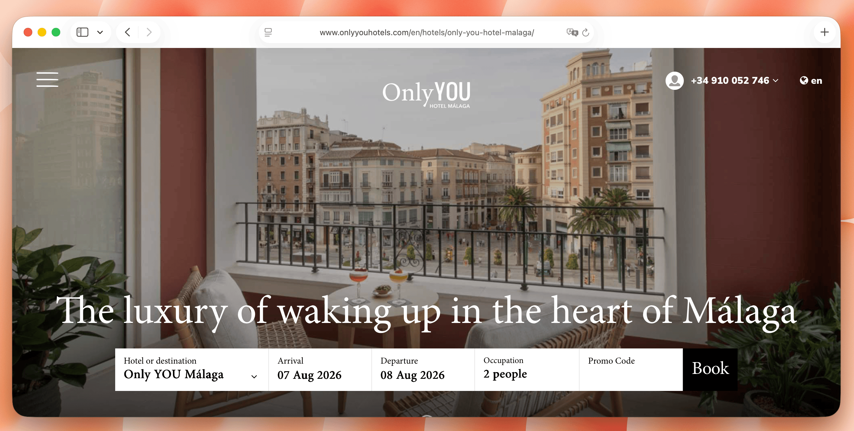
- A clear value proposition. Skip generic lines like "a place to relax". Say where you are and what makes the property worth choosing, something like "boutique oceanfront stay in Miami, 5 minutes from South Beach." Specific beats poetic.
- A search widget in the hero section. Don't make guests dig through a menu to find "book now". Put a simple date and guest picker right in the first screen they see, so checking availability takes one click, not three.
2. Show a price early, not just at checkout
"From €89" on its own tells a guest almost nothing, and hidden pricing tends to read as suspicious rather than mysterious. Two ways to fix this.
- On room and category pages, show an indicative rate directly on the card, "Double room from €149/night", so guests can compare options without clicking into each one.
- The moment a guest picks dates, show a real price tied to your calendar, before they've committed to filling out a form.
For properties with highly varied rooms, showing exact units instead of only broad categories can increase confidence at this stage. This room display playbook explains when that approach helps.
Ambiguity at this stage sends people straight to an OTA, where at least the number feels final.
3. Cut the booking form down to what you actually need
Every extra field is a reason to abandon. Name, email, dates, and payment details are usually enough to start. Fields like "how did you hear about us" or a long dropdown of arrival time slots can wait until after the booking is confirmed, in a follow-up email.
Look at your current form and ask, for each field, what happens if a guest skips it. If the answer is "nothing important," remove it.
4. Sell rooms with real photos, not stock ones
Stock photography, or a wide-angle shot pulled from your Booking.com listing with the branding cropped out, doesn't build trust. Guests booking direct want to see what they're actually going to sleep in.
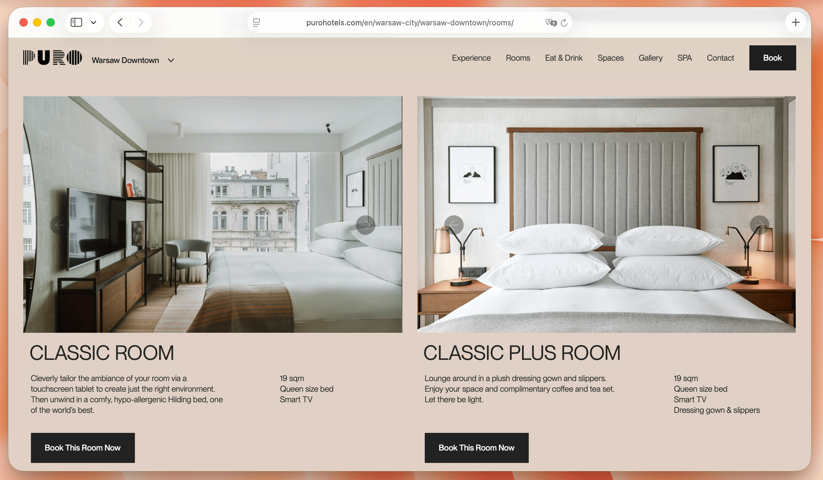
Photograph rooms in natural light where you can, avoid lenses that distort the space, and shoot beds the way guests will actually find them. Pair 3 to 5 photos per room category (bed, bathroom, view, one key amenity) with short bullet points covering size, bed type, and max occupancy.
A short video clip can help too, a 5 to 10 second loop of the room or a property highlight. Keep it compressed and set it to load after the photos, not before, so it doesn't slow down the page it's meant to sell.
5. Make it fast, especially on mobile
A large share of direct booking traffic arrives on a phone, often on a train, in an airport, or between meetings. If your site takes more than a couple of seconds to load, a meaningful number of those visitors leave before they see a single room.
Compress images, skip autoplay video backgrounds on the homepage, and test the site on an actual phone with average mobile data, not office wifi. Speed is one of the least glamorous decisions you'll make, and one of the highest-impact ones.
6. Show availability live, not through a request form
Some smaller properties still route bookings through a contact form: guest submits dates, property replies within 24 hours to confirm. Every hour between the inquiry and the confirmation is an hour the guest might spend booking somewhere else, usually an OTA with instant confirmation.
A connected booking engine shows real availability instantly and confirms the reservation on the spot. If you're still relying on manual replies, this is likely costing more bookings than any other single item on this list.
7. Help guests picture the stay, not just the room
Two things guests often leave your site to check elsewhere: what's nearby, and whether the property fits their specific trip.
- An interactive map with real distances. Walking or driving time to key attractions, the nearest transit stop, a couple of good restaurants. If guests have to open Google Maps in a new tab to answer this, some of them won't come back.
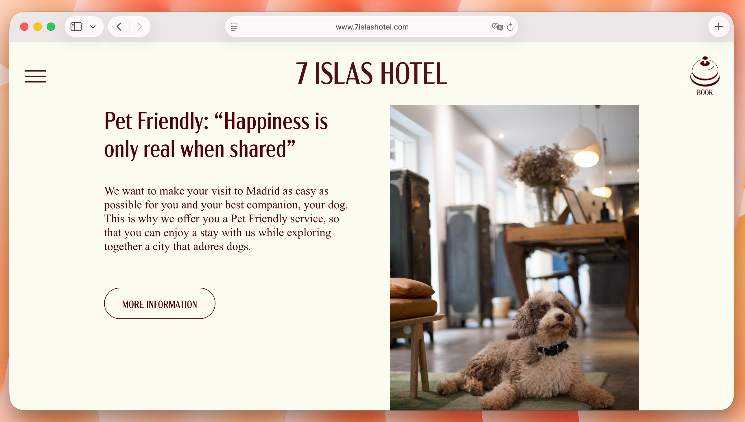
- Landing pages for specific intent. A page for "pet-friendly rooms", "wedding and event venues", or "long stays for remote workers" speaks directly to a guest who already knows what they need, and tends to rank well for those exact searches too.
8. Use trust signals at the moment of decision, and be careful with discounts
Reviews, a visible cancellation policy, and recognizable payment logos matter most when a guest is about to click "book", not on a separate about page. A short review snippet or a "free cancellation" note near the booking button can be the difference between finishing the booking and leaving to double check on Google first.
Exit-intent popups, triggered when a visitor moves to close the tab, can recover some of those guests. Be careful what you offer, though. A blanket price discount can put you in breach of rate parity agreements if it undercuts the rate showing on your OTA listings. A perk instead of a price cut, free breakfast, late checkout, no booking fee, gets the same result without the risk.
9. None of this works without the right booking engine
A well-designed site still loses bookings if the engine behind it is slow, redirects guests to a separate, badly branded checkout page, or shows a room as available when it's already been sold on another channel.
A few things worth checking before you build the rest of the site around it:
- Does it sync in real time? A booking engine connected through a proper API updates availability instantly across every channel. One still relying on iCal sync can lag by hours, long enough for the same room to get booked twice. We covered the difference in more detail in iCal vs. API connections.
- Does checkout stay on your site? Guests who get redirected to a generic third-party payment page lose confidence right at the finish line. The booking flow should look and feel like the rest of your site.
- Is it built mobile-first? Given how much traffic arrives on a phone, checkout needs to work as well on a small screen as the homepage does.
- Does it talk to your PMS? A booking made on the site should land directly in your property's system, no manual re-entry, no risk of someone typing a date wrong. Get this part right and every other tip on this list actually has something to convert into.
The bigger picture
None of these changes require a full site rebuild. Most can be done incrementally: swap in real photos this month, tighten the booking form next month, add live pricing when your booking engine allows it. The properties that win more direct bookings usually aren't the ones with the flashiest website, they're the ones that removed every small reason for a guest to hesitate or leave, and gave that guest a booking engine that actually keeps its promises.
For a closer look at why the payoff is worth the effort, our guide on booking engine vs. OTA ROI breaks down the numbers property by property.
Read next: